109 Long Thin House*
. . . for a very small house or office the pattern of Wings of Light (106) is almost automatically solved - no one would imagine that the house should be more than 25 feet wide. But in such a house or office there are strong reasons to make the building even longer and thinner still. This pattern was originally formulated by Christie Coffin.

The shape of a building has a great effect on the relative degrees of privacy and overcrowding in it, and this in turn has a critical effect on people's comfort and well being.
There is widespread evidence to show that overcrowding in small dwellings causes
psychological and social damage. (For example, William C. Loring, "Housing
Characteristics and Social Disorganization," Social Problems,January
1956; Chombart de Lauwe, Famille et Habitation,Editions du Centre
National de la Recherche Scientifique, Paris, 1959; Bernard Lander, Towards
an Understanding of Juvenile Delinquency,New York: Columbia University
Press, 1954.) Everyone seems to be on top of everyone else. Everything
seems to be too near everything else. Privacy for individuals or couples
is almost impossible. It would be simple to solve these problems by providing
more space - but space is expensive, and it is usually impossible to buy
more than a certain very limited amount of it. So the question is: For
a given fixed area, which shape will create the greatest feeling of spaciousness?
There is a mathematical answer to this question. The feeling of overcrowding
is largely created by the mean point-to-point distances inside a building.
In a small house these distances are small - as a result it is not possible
to walk far inside the house nor to get away from annoying disturbances;
and it is hard to get away from noise sources, even when they are in other
rooms. To reduce this effect the building should have a shape for which
the mean point-to-point distance is high. (For any given shape, we may
compute the mean or average distance between two randomly chosen points
within the shape). The mean point-to-point distance is low in compact
shapes like circles and squares, and high in those distended shapes like
long thin rectangles, and branched shapes, and tall narrow towers. These
shapes increase the separation between places inside the building and
therefore increase the relative privacy which people are able to get within
a given area. 
Buildings which increase the distance between points. . .
Of course, in practice there are limits on the long-thinness of a building. If it is too long and thin, the cost of walls becomes prohibitive, the cost of heating is too high, and the plan is not useful. But this is still no reason to settle only for box-like forms.
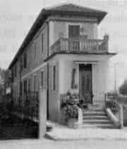
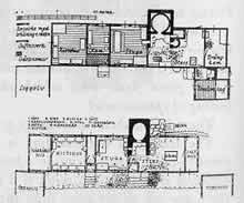
A small building can actually be much narrower than people imagine. It can certainly be much narrower than the 25 foot width proposed in Wings of Light (107). We have seen successful buildings as narrow as 12 feet wide - indeed, Richard Neutra's own house in Los Angeles is even less.


Long thin houses.
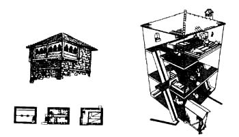
And a long thin house can also be a tower, or a pair of towers, connected at ground level. Towers, like floors can be much narrower than people realize. A building which is 12 feet square, and three stories high, with an exterior stair, makes a wonderful house. The rooms are so far apart, psychologically, that you feel as if you are in a mansion.

A Russian tower.
Therefore:
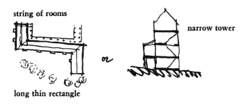
In small buildings, don't cluster all the rooms together around each other; instead string out the rooms one after another, so that distance between each room is as great as it can be. You can do this horizontally - so that the plan becomes a thin, long rectangle; or you can do it vertically - so that the building becomes a tall narrow tower. In either case, the building can be surprisingly narrow and still work - 8, 10, and 112 feet are all quite possible.


Use the long thin plan to help shape outdoor space on the site - Positive Outdoor Space (106); the long perimeter of the building sets the stage for Intimacy Gradient (127) and for the Cascade of Roofs (116). Make certain that the privacy which is achieved with the thinness of the building is balanced with the communality at the crossroads of the house - Common Areas at the Heart (129). . . .
![]()
A Pattern Language is published by Oxford University Press, Copyright Christopher Alexander, 1977.